

Using Bricks Builder as my theme and AutomaticCSS as my styling framework meant that I could’ve used overlay headers throughout the website by simply toggling a few options on and adding the header height values for five breakpoints in the AutomaticCSS dashboard. But I wanted the ability to toggle the header overlay on or off per page… and then I realised I’d be needing the ability to choose between light coloured header elements and dark depending on the page design.
Tools required
We’ll need a custom fields plugin to create the required fields to be available on all pages and posts on the website—Metabox in my case, but you could use ACF or similar.
I’ve used a small PHP snippet, and some custom CSS to make a lot of the magic happen. You could use a child them to store the PHP and CSS, but I prefer to use WPCodeBox code snippets plugin for this sort of thing. Using WPCodeBox allows me to use SCSS with a ‘on save’ live reload in the builder and on the frontend—can recommend.
AutomaticCSS is a must, although you could do this without it, you’d want to set up a fluid-responsive spacing framework that uses CSS Variables so you can hook into those tokens and easily use calc() functions.
Create the required custom fields
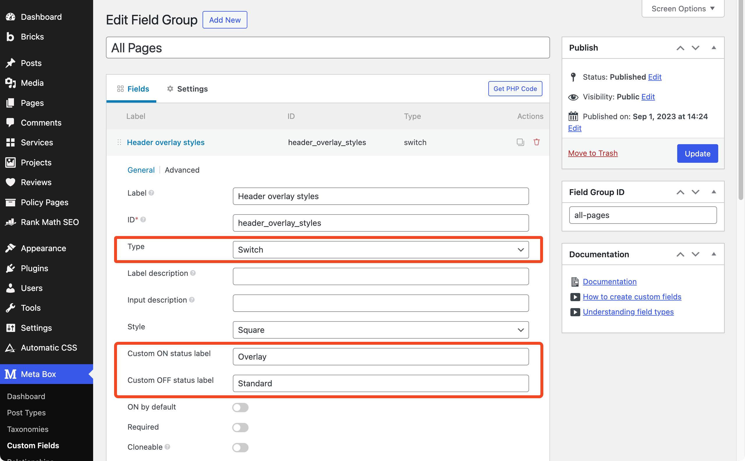
First of all we’ll create a custom field group with Metabox. This field group is assigned to all pages and posts types and contains two ‘Switch’ fields.
- Header overlay styles (switch) – Custom ON status label of ‘Overlay’ and Custom OFF status label of ‘Standard’
- Header overlay elements colour (switch) Custom ON status label of ‘Light’ and Custom OFF status label of ‘Dark’
Metabox switch fields store the ON value as ‘1’ so we’ll use ==1 or !=1 when doing interactive things as OFF isn’t always stored in the database as ‘0’, sometimes it is null which can break conditional logic or styling when targeting dynamic data attributes.
Preparing the logo file
For this website I use a svg logo which simplifies the colour swap later for when I want header to overlay a dark background. A little file preparation needed to be done to the logo so I opened the svg file in a text editor and looked through the code for the fill="#000" value and changed it to fill="var(--mo-logo-colour)" which I’ll use later to assign a colour with locally scoped variables.
NOTE: in Bricks (v.1.9.2) you have to apply the var(--mo-logo-colour) as a ‘raw’ colour value at the #ID level to the SVG element. Once it is set at the #ID level you can then target it with a locally scoped variable at the class level.
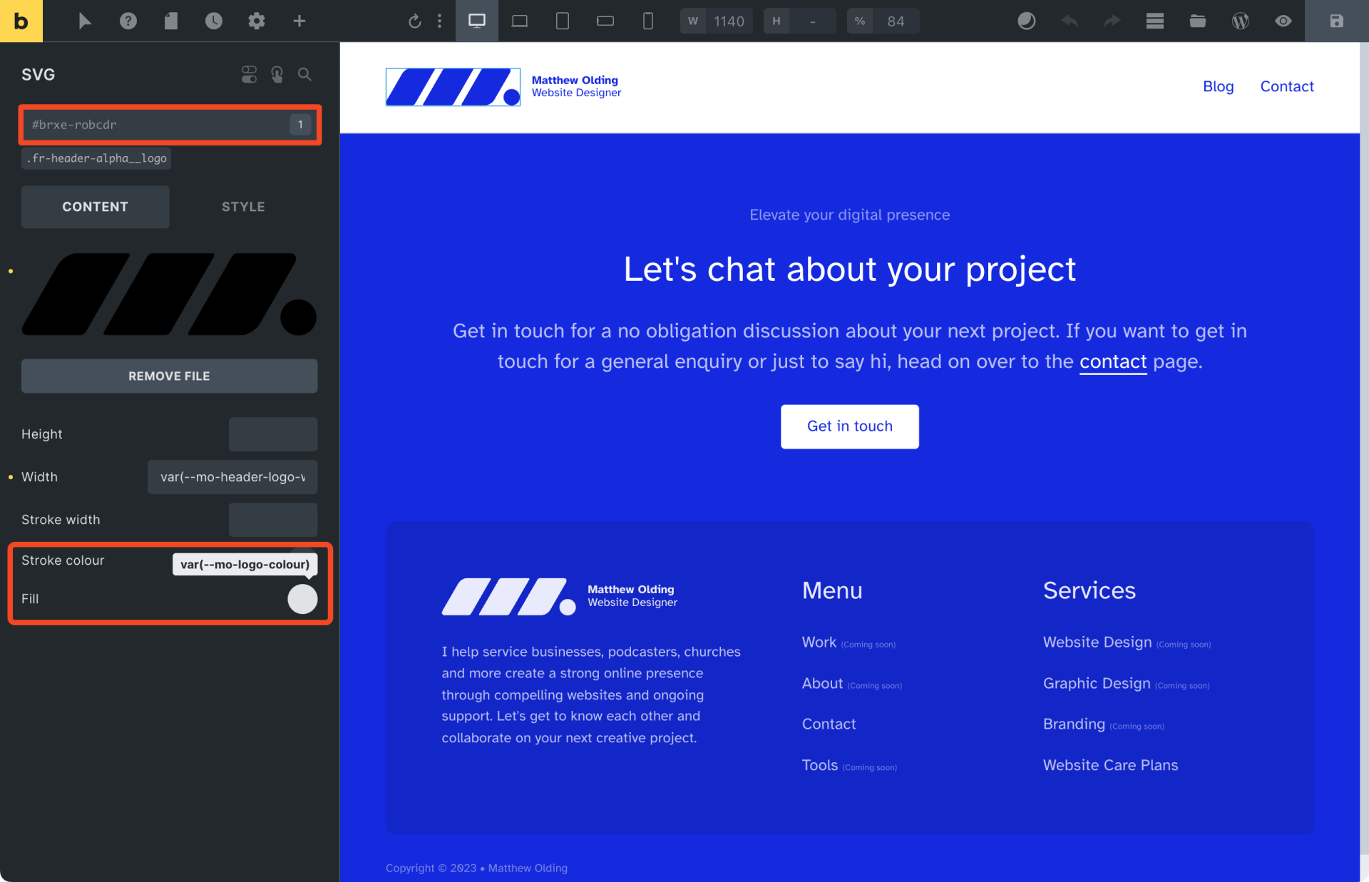
With the css variable applied to the svg element at the ID level, we are free to hook into that variable with our class via the bricks builder interface or in our WPCodeBox SCSS sheet.
/* Custom CSS to colour the logo by hooking into ACSS */

.fr-header-alpha__logo {
  --mo-logo-colour: var(--action);
}
Code language: CSS (css)
Adding the PHP snippet
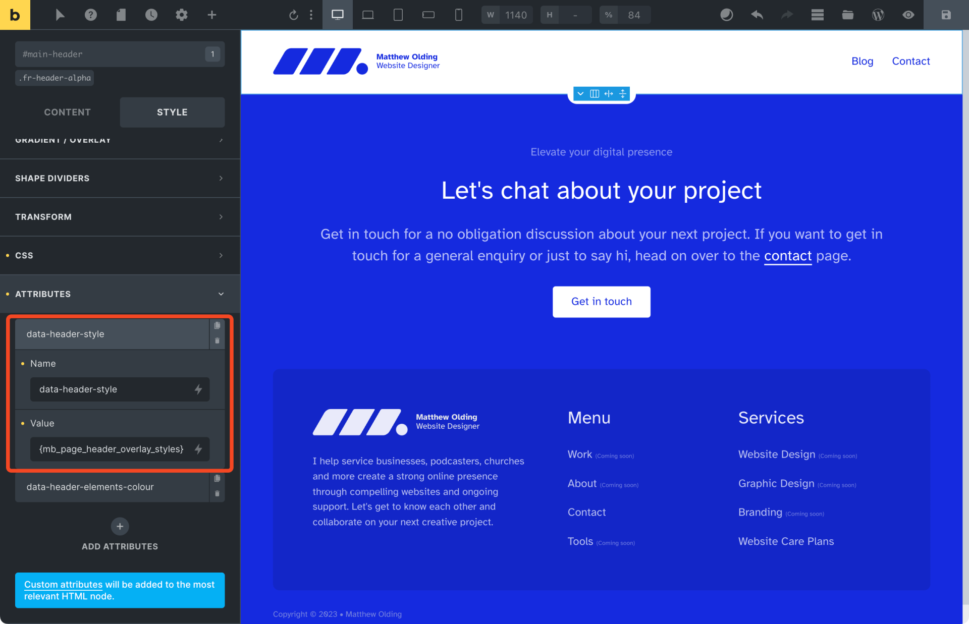
Using the Bricks body attributes filter we’ll add data attributes to the <body> tag that contain the values from our Metabox switches.
add_filter( 'bricks/body/attributes', function( $attributes ) {

  $attributes['data-header-style'] =  rwmb_meta( 'header_overlay_styles' );
  $attributes['data-header-elements-colour'] =  rwmb_meta( 'header_elements_colour' );

   return $attributes;
} );
Code language: PHP (php)
Checking the switch field and snippet are working
With the PHP snippet activated, we need to head over to a page and switch on the overlay header field.
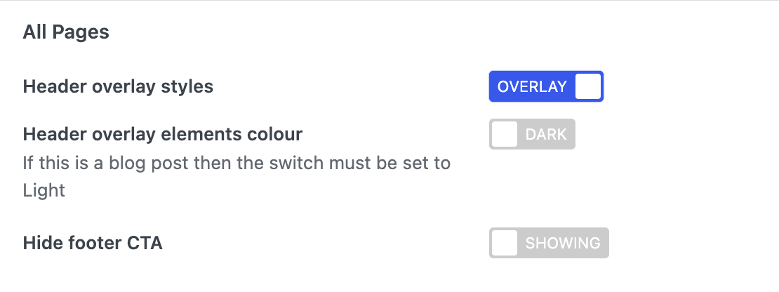
Then we view the page on the front end to see if the data attribute is showing in the DOM as expected.
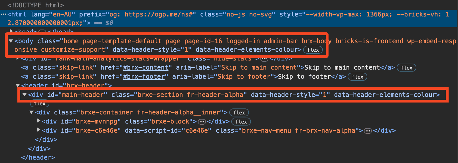
On the <body> element we can see that data-header-style="1" is showing which means we can use it for targeted styling. Also highlighted in this screenshot is <div> that also has the data attribute added, which was achieved in the bricks builder by adding the data attribute name and using dynamic data referencing the Metabox field for the value.
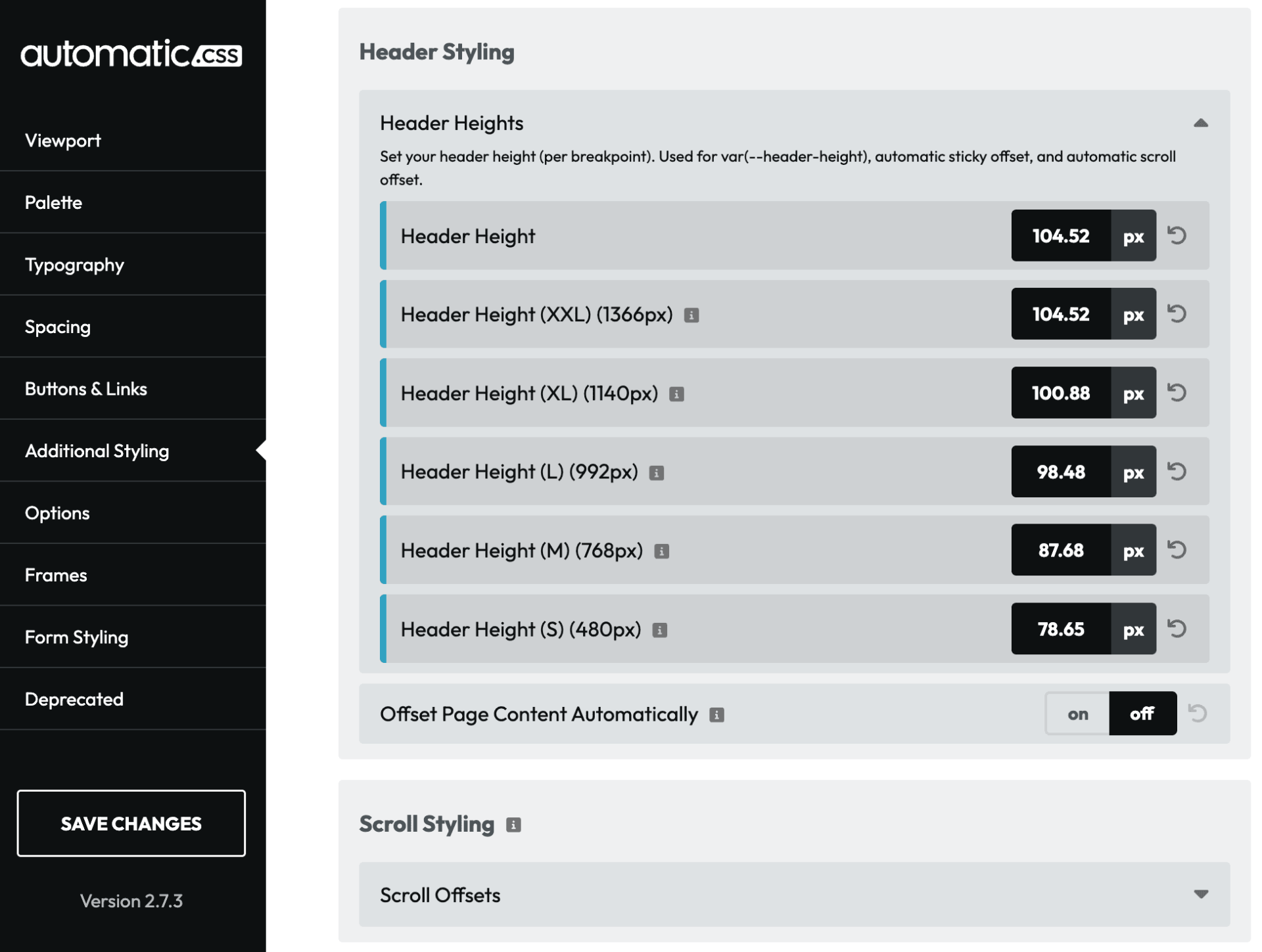
Setting up ACSS for overlay headers
ACSS offers a neat feature that lets you define overlay header offsets automatically once you enter your header height at each break point you have defined in Bricks. For this use case I cannot use the ‘Offset Page Content Automatically’ because I need it to be ‘on-demand’, but by setting the header heights I can still use the var(--header-height) token to add the correct amount of extra spacing to the top section of pages with overlay header toggled on.
Custom styling for overlay headers
When we switch on the overlay header for a page the colours for the logo and navigation remain as they are defined via the Bricks Builder, but we need a few tweaks to make it ‘float’ over the top section and for the links to be coloured with my ‘action’ colour defined in ACSS. To target the element correctly we use the data attribute as one of the selectors.
#brx-header {
[data-header-style="1"] {
        position: absolute;
        top: 0;
        left: 0;
        z-index: 9999;
        background-color: transparent;
        border-bottom: none;

        a {
            color: var(--action);
            &:hover {
                color: var(--action-hover);
            }
        }
}
Code language: SCSS (scss)
There are some instances where I’d like the overlay to work on a dark background, this is where we can override the SVG, text, and nav colours using another data attribute selector and locally scoped variables.
#brx-header {
[data-header-style="1"][data-header-elements-colour='1'] {
        a {
            color: var(--white);

            &:hover {
                color: var(--white-trans-70);
            }
        }

        .header-brand-wrapper {
            color: var(--white);
            transition: all 0.2s ease-in-out;

            .fr-header-alpha__logo {
                --mo-logo-colour: var(--white); /* redefining the variable, i.e. locally scoped variable */
            }

            &:hover {
                opacity: 0.7;
                color: var(--white);

            }
        }

        .bricks-mobile-menu-toggle {
            color: var(--white);
        }
    }
}
Code language: SCSS (scss)
The above SCSS code takes care of how the header should look in the two overlay styles, but we also need to set style instructions to add the header height as extra space to the top over every section on effected pages. This is what we needed the PHP snippet for, we needed the data attribute added to the <body> of the page for this to work.
body[data-header-style="1"] #bricks-blank-canvas > .actions,
body[data-header-style="1"] main:not(.panel-content) > *:first-child:not(.fr-blog-post-delta) > *:first-child:not(.bricks-shape-divider),
body[data-header-style="1"] main:not(.panel-content) > article > *:first-child > *:first-child:not(.bricks-shape-divider),
body[data-header-style="1"] main > *:first-child > .bricks-shape-divider ~ .brxe-container,
body[data-header-style="1"] main > article > *:first-child > .bricks-shape-divider ~ .brxe-container,
.blog main > section[data-header-style="1"] > *:first-child {
      margin-block-start: var(--header-height);
 }
Code language: CSS (css)
I would love to claim ownership of the above selector magic, but I ‘acquired’ most of this code from inspecting the DOM at geary.co and then customised slightly for my use case.
If you want your whole site to have overlay / sticky headers then, you can just use the settings in AutomaticCSS to get the job done and but if you do want to toggle overlay / sticky on and off per page you should watch Kevin explain exactly how it is done in this youtube video.